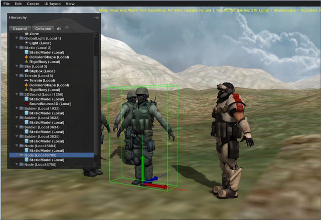
Better late than never so I thought I’d share this old UI tweak that I did when I got started with the engine and playing around with it. This was done a couple of years ago with Urho 1.3 and during Google Group days. The interface was still simple back then with just the menu bar and a couple of windows. I did not bother to share it because it was not fully completed and was just meant for my own personal use. I also could not obtain the copy anymore because I recently found out that this was included with my failed hard drive, along with other old dev stuff but fortunately I found these 2 screenshots that I got inside my docs folder while I was doing my monthly file cleanup routine. The theme was inspired by dark theme engine editors like Unity Pro, CrySDK, UE4, etc.
If I have the time I would definitely redo this with an updated version, but I’m currently busy in completing a demo right now. I hope this should give you guys added motivation on what can be done with Urho3D’s flexible UI system, though I would still prefer a C++ Qt library version for a solid editor and have the builtin UI just for in-game stuff. 
cheers. 


