Archive 17/01/2023.

New Logo / Icon

JulyForToday

I thought that Urho3D could use a logo/icon that uses flat design, so here is my attempt, with a few variants.

[color=#FF8000][size=150]Here is the link for the .zip containing the .xcf and .psd files.[/size] :slight_smile:[/color]

Made in gimp using paths. The original is 512x512 in size, but the paths can be scaled so it can be made larger if needed (for a loading screen or something).

=================================================================================================================================

Also worth mentioning that I had thought about making a new flat logo for Urho before, but wasn’t sure exactly what it should look like. Then I recently saw this:

Screenshot from Obduction

Thought it wasn’t far off from what would make a good logo, and felt compelled to follow through with my idea.

1vanK

what about something like this:

JulyForToday

Not entirely sure what you are getting at with that last image, but here is another variant that is similar.

Flat design is pretty flexible, and a perfect starting point for endless variations.

Grabbed that font from font squirrel, in case anyone cares.

codingmonkey

this some kind neutral icon, I think need more aggression for first impression

1vanK

On russian forum we had this variant xD

codingmonkey

awesome xD

jmiller

Nice efforts!

DropBox is a frequent choice: large bandwidth limit, basically-direct download links, integration.

[quote=“1vanK”]On russian forum we had this variant xD
[/quote]
:laughing:

JulyForToday

Feel silly, forgetting dropbox like that. lol

Here is the link for the .zip containing the .xcf and .psd files.

Also put it in the original post. Feel free to make your own variations!

Obviously it’s up to the community and Urho’s project maintainers if they want to adopt it as the logo, or some derivation. For the sake of clarity, I don’t personally care about licencing or credit/attribution for the logo, it’s a gift/contribution to the Urho community. So any rights to this logo now belong to Urho’s project maintainers. And as far as I care, anyone can use it for any Urho3D related projects can feel free to modify/distribute/whatever. I personally prefer that it only be used in connection with Urho3D, but since I’m giving my rights to it away, it’s not my call. Enjoy.

Mike

There was a similar thread a long time ago.

Modanung

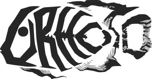
Made this and added it to LibreGameWiki.org.

TheSHEEEP

Well, that looks nice and stylish!

I’m not fully sure about readability, but then again, a logo doesn’t necessarily need to be “read”. And this one can if you know what you’re looking for.

Why is it a fish, anyway?
I like it, but… why is it that way? :smiley:

Eugene

I like the last one.

1vanK

I like Modanung’s varian too. Stylized text “Urho3D” is cool

sabotage3d

I think it is a bit unreadable. Technically a logo doesn’t need to be over the top. If you look at some of the most popular engines their logos are using classic fonts.

weitjong

I could almost swear I can still see Urho (albeit a very dead one) from the outline, great job.

Eugene

The greatest thing in this logo is that it is simultaneously nice image of fish and readable… almost readable text.
Usually such logos suffer from significant distorsion either image or text. This logo doesn’t.
I mean, image is not distorted by text and recognized as image firstly. At the other hand, text is also recognizeable and almost didn’t lose its form.

1vanK

May be with black outline text is more readable?

cadaver

This logo is surprisingly (black) metallish, great work!

And since the fish has been dead many years it’s appropriate you see the bones :slight_smile:

Victor

I’d really like to see this logo at the beginning of a game splash. Looks so good! Great work!

cadaver

Modanung, could you do an official version of the larger logo (ie. with Urho3D text) with black outline? Perhaps have the background transparent so that it’s easy to compose where required.

rasteron

Nice one!

@TheSHEEEP

Scroll down the home page, name origin explained there. :slight_smile:

urho3d.github.io/

Victor

I’ll be honest, I’ve read that description many times, and for some reason I always thought it was talking about a legendary person who hunted fish… and kicked off Urho… It wasn’t until I saw this post that I realized what the fish really meant. :confused: I mean, the description of this mighty fish is pretty epic. Reading, “among the fish”, doesn’t quite register the we’re talking about a fish (in my mind). But this thread has made things much clearer! :slight_smile: Thank you

Modanung

Thanks for all the (positive) feedback. :slight_smile:

[quote=“cadaver”]This logo is surprisingly (black) metallish, great work!
And since the fish has been dead many years it’s appropriate you see the bones :slight_smile:[/quote]
Urho is even wearing corpse-paint. :wink:
I’m glad you’re not offended by his morbid appearance.

Something like this? Might work well as a patch, too.

Victor

Be sure to check out this song.
Cadaver claims it’s just about the fish. To me it’s also about the community. :stuck_out_tongue:[/quote]

Will do!

1vanK

Something like this? Might work well as a patch, too.

Ah, thank you. I found out that GIMP can import *.svg as contour :slight_smile:


but I like your last variant with black fish

Modanung

Do you also know that it’s the default format for Inkscape? And that these days SVG is supported by all browsers?

1vanK

[quote=“Modanung”]
Do you also know that it’s the default format for Inkscape?[/quote]

I never use it :slight_smile:

Modanung

Alternate versions:

Modanung

And another one featuring the spirit of Urho. This one also works pretty well on a dark background.

cadaver

Cool, thanks for these! I believe there should be enough to choose from.

“Disciples of Urho” is indeed about new fish being planted in the tank (now we don’t have it any more) at LudoCraft office, and new battles starting soon after. But yes, I suspect it could also be about the community. :slight_smile:

Modanung

My pleasure! :slight_smile:

Modanung

One more then…

weitjong

@Modanung, I like all your variants, well, except the last one. The new stroke on the ‘r’ reminds me of a Chinese idiom about adding legs after drawing a snake. :wink:

1vanK

One more then…

hole in letter “O” is filled. Is it intention?

yushli

Be sure to check out this song.
Cadaver claims it’s just about the fish. To me it’s also about the community. :stuck_out_tongue:[/quote]

Will do![/quote]

Is this song singed and played by cadaver? :astonished:

szamq

My first thought was isis flag :unamused: esspecialy on black background

Modanung

Well in this case it concerns a fish and his fin. But here’s one without. Also the ghost-version on the previous page has been updated.
Seems to me like that idiom may have shaped their dragons. :slight_smile:

It was to suggest a vertebra in a cross section. But I guess it works just as well without the filling, which has been removed.

Better now, right? :slight_smile:

cadaver

[quote=“yushli”]
Is this song singed and played by cadaver? :astonished:[/quote]
Yeah, that’s me. Drums are programmed, guitars + bass + vocals actually recorded.

1vanK

in my opinion last variant luckeyproductions.nl/images/urho3d_nofin.svg is optimal

Modanung


Sent in as pull request, replacing the logo in the samples.

weitjong

I also agree with 1vanK.

Nah… my ancestor found dragon bones long before this dude start to learn to draw. :laughing:

I doubt it at first. Wow.

ghidra

If I may add my opinion to the mix… even after the logo has been adopted :wink:

I like the concept of the logo actually. But there are a few small nitpicks that I have. Actually, just 2 things.

  1. the D in 3D. Is the only letter that breaks the line of any other letter.
  2. the weight of the U is different that all the other letters.

I think I understand why for each case. But a better design would solve those 2 issues in favor of more consistent design language.

Those are my literal 2 cents.

DrAlta

I think it would look better is the ‘D’ was behind the ‘3’ instead of in front if it.

boberfly

@Modanung - I’m reminded of scribbles on the back of school textbooks when I see this. I like the skeletal aspect of the new logo though!

@cadaver - hahaha multi-talented, I’m immediately reminded of the band Kreator

TheEndOfUsAll

I really loved the new logo. Maybe the lines could be a bit more artsy with more prominent bone shapes and also I didn’t like the ‘mouth’ shape, but overall the concept is awesome and really fits not only the legend but also the ‘mood’ of the legend itself AND the community (because we’re hardcore badass devs lol)…

[quote=“ghidra”]If I may add my opinion to the mix… even after the logo has been adopted :wink:

I like the concept of the logo actually. But there are a few small nitpicks that I have. Actually, just 2 things.

  1. the D in 3D. Is the only letter that breaks the line of any other letter.
  2. the weight of the U is different that all the other letters.

I think I understand why for each case. But a better design would solve those 2 issues in favor of more consistent design language.

Those are my literal 2 cents.[/quote]
I respectfully disagree 100%. I think the “3D” being in “3D” is very appropriate, if that wasn’t on purpose it’s a happy accident. And the head being ‘bolder’ also makes it more obvious it’s a skull without affecting readability.

I also disagree, the “D” wouldn’t be so obvious, it would read more like 3O or something.


I also disagree on it being unreadable and such, I really loved it, it has lots of meaning, and it’s not a ‘dumb’ logo as we see these days :slight_smile:.

1vanK

It would be cool if Modanung public images under license that allows free modifying of logo for use modified version logo in projects

EDIT: I mean not only logo from repository, but from this thread also

ghidra

To be sure… with all due respect. I don’t want to come barging in in the 11th hour or the 13th hour, and stomp all over someones flag.
Here’s an example of what I was suggesting…

It’s also not without it’s issues, and by no means perfect.

jmiller

I like the design of this one… It deserves to swim with the others; maybe they share ideas. :smiley:

[quote=“cadaver”][quote=“yushli”]
Is this song singed and played by cadaver? :astonished:[/quote]
Yeah, that’s me. Drums are programmed, guitars + bass + vocals actually recorded.[/quote]

I dig. :sunglasses:

Lumak

[quote=“ghidra”]To be sure… with all due respect. I don’t want to come barging in in the 11th hour or the 13th hour, and stomp all over someones flag.
Here’s an example of what I was suggesting…

It’s also not without it’s issues, and by no means perfect.[/quote]

Could you post one with a transparent background please. Thx.

1vanK

[quote=“ghidra”]To be sure… with all due respect. I don’t want to come barging in in the 11th hour or the 13th hour, and stomp all over someones flag.
Here’s an example of what I was suggesting…

It’s also not without it’s issues, and by no means perfect.[/quote]

Good variant! What about version with solid fins and tail?

ghidra

I’ve slept on it. And the more I think about it, I’m not sure that my variant is an improvement.

In fact I feel now, that a proper logo should not try to shoe horn the name into an image.
My current view is that the logo should just be the fish. A fast read of the silhouette perhaps.

Looking at other engines (that also start with a “U”), one is a U, the other is a cube. Urho’s should be a fish. A skeletal fish.

weitjong

Why should we care other logos out there look like? IMHO, to be creative also means to be original.

jmiller

I also think ‘easy to read’ tends to be a design goal, but I think it is easy enough after a glance. I like these - creative, distinctive, gnarly. :sunglasses:

Modanung

Still, nice variation. :slight_smile:

Since it’s also on LibreGameWiki it is already licensed CC-BY-SA, which allows for this. The same goes for any other version I put here.
Here’s another only-u icon:


And a U3D icon:

cadaver

The circle U icon looks excellent. Feel free to pullrequest it.

Modanung

Thanks!
Something like this?

Modanung

Also created a PR for the website:

ghidra

I’m happy where this has gone.
HD, those variations are awesome! (which are not posted in the new forums… but they are in the old one)
I like the “U” alone.
Expecially, the one being used on the new forums now. (black with the circle encompassing the entire u). As well, as how it is used as the first letter in “urho3d”. Very classy.

Eugene

IMO on this site (U) icon shan’t replace U letter. It breaks readability. RHO3D? ORHO3D?

hdunderscore

Just posting the svg’s I’ve been working with in case anyone wanted to play with them.

https://drive.google.com/open?id=0B8btTTaJ0buXbUhMVnJDenVtc3M
https://drive.google.com/open?id=0B8btTTaJ0buXVXV1SzBHZ3pydlk

(I draw off-canvas in inkscape all the time, you’ll have to open in inkscape to see everything)

I did a tweak on the @ghidra versions H on only one of the fish (spot the difference :grinning:), here is what it looks like: