Archive 17/01/2023.

Colors look washed out (decreased saturation?)

NessEngine

Hi all,
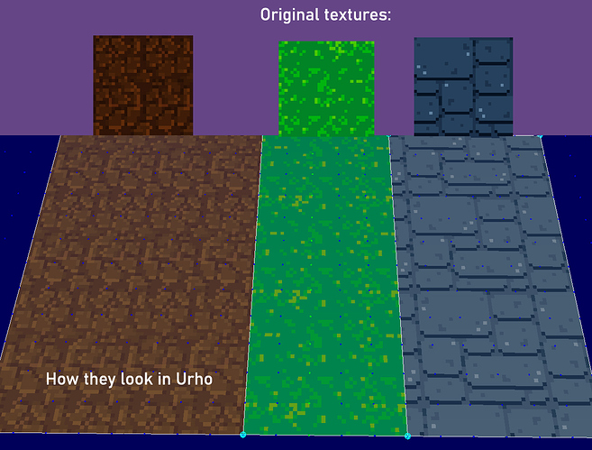
I’m experimenting with a new Urho project, and for some reason all the colors look like saturation was reduced. Please see the following screenshot:

Now you may think its lighting, but even if I reduce ambient light until they are as dark as the original texture, its still much less saturated and just appear like darker version of the colorless textures.

Their material is very basic:

<material>
    <technique name="Techniques/Diff.xml" quality="0" />
</material>

Any ideas why textures look so colorless and how do I fix it? Texture files are simple pngs.

Thanks!

Lumak

Can you add the following in your material file and see how it looks?

	<parameter name="MatDiffColor" value="1 1 1 1" />
NessEngine

Thanks, but it looks the same.
PS don’t know if relevant but the geometry is a custom geometry I build in runtime.

Lumak

Ok, change your technique to
DiffUnlit.xml
and see if there’s any difference.

NessEngine

Well its brighter :slight_smile: but still washed out (top-left is original for reference)
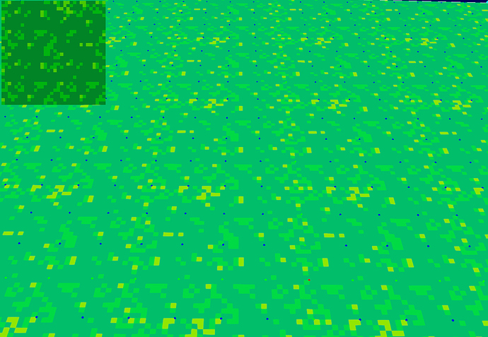
Thanks though. Adding another idea - I’m using existing window form, maybe I’ll try to create window via Urho, if that possible.

Lumak

That’s a good indication that your normals that you’ve constructed are somewhat skewed to prevent full lighting effect. Once you get that fixed, you can tweak your MatDiffColor values to get the proper shading that you’re looking for.

NessEngine

Nah actually my normals were OK. I removed the windows form and allowed Urho3d to create its own window and now all the colors looks OK :slight_smile:

Don’t know if its a bug in Urho or I did something wrong, but windows form messed it up.

Thanks for the tips though!

SirNate0

If you got it then good. My other guess would be gamma correction, maybe?