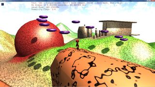
There are three things about Urho’s shadows that or bugging me:
- there is some blocky flickering when the shadow is close to the shadow caster, as can be seen in this image on the orange mountain edge in the lower part of the screen. This is typical for self shadowing. Here it’s also causing some stripes. This seems to have to do with the fifth(?) parameter of CascadeParameters that sets the shadow starting distance, but I want the shadows to start close.
-
Urho seems to use four images(?) for shadow with different resolution for different distances: There is always a thin, black, blurry edge between those “zones”. You can see this “dotted” edge here starting directly right of the “Esc = quit.” text at top and going through the whole image. It’s much more visible and annoying when the camera is moving.
-
can there be more of those “zones”? I’m using these parameters: “light->SetShadowCascade(CascadeParameters(5.0f,10.0f,50.0f,1000.0f,0.01f,0.5f));” and the jump to 1000 is quite big, but when making the lower values bigger, the closer shadows get too blurry. Two to four more zones would make this much better.
Can the shadows be improved somehow?
I’m using a relative up to date Git version but those issues have been the same in the latest stable.


